I personally think the new cover photos for Facebook Business Pages are a good idea. Graphically to me it is a billboard in a sense. Another good place to show some new photos of your business or maybe some events you are doing to keep people interested and updated with what is going on. Changing the cover photo is as easy as a simple photo upload, no coding needed. One must know the correct dimensions of the cover photo canvas in order for it to function properly and get your image across to anyone who checks out your page. I like the idea of the new profile pictures layered over a portion of the cover photo. It creates a sense of dimension which is important in design. It may even be a good idea to match the colors in your profile picture to the cover photo so that it blends well and they brand off each other. If created by the right designer a cover photo can say many things, what you do, who you are, where you are, and what your future plans may be. For example I split the design up for my cover photo for my personal Facebook into 3 sections. One section would be somewhere on the cover photo that I am a graphic designer, another with a picture of me playing drums so people would know that is one of my main interests and another section I have a picture of me in a suit looking professional. So I created a look that told people what I am most passionate about and that I can be a rocker and be professional as well and people see that as something fun. If you can show more than just a business face and that your a human who has some fun and personality and you will be on the same page with the viewers.
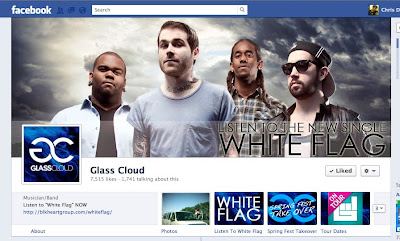
Here is good example of one of my favorite bands using the Facebook Cover Photo correctly advertising that they have a new song out: -Chris
Links to Website
Friday, March 9, 2012
Timeline Design Through the Eyes of a Graphic Designer
Subscribe to:
Post Comments (Atom)

No comments:
Post a Comment